UX design is often thought of as simply being a well-designed website or mobile app with functional yet aesthetically pleasing features.
But this definition is one that is long in the past now. A modern interpretation of UX design is to enhance all aspects of an end user’s interaction with a business, its products and everything it has to offer.
This expands across multiple user touchpoints – from an elegantly-designed website, to the tone of voice used in the virtual assistant.
User experience used to just be about eliminating any hurdles and allowing people to get through a process as easily as possible. It has now become more sophisticated, shifting towards looking at what the customer is trying to achieve during their experience and aiding the journey they are on.
The specific areas in which this can be done will vary for different companies. It could be that a brand’s UX focus is on their telephone hold message, or the experience of unboxing one of their products.
However, more often than not, UX professionals work on the interfaces, interactions and design of software products for desktop and mobile.
Today, there’s more behavioural science involved. It’s about understanding the shortcuts that our brains use when using a service and designing with these things in mind.

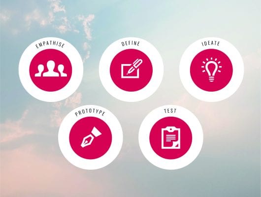
To enable a fantastic user experience, there are 5 key steps that must be well understood and implemented:
- Talk to users and get to understand their needs and any problems they may face. Delve deep inside their heads and look to gain a deep understanding of their required outcomes.
- Identify which part of the problem you want to solve and what the outcomes of that solution might look like.
- Create ideas that can solve the user’s problems now that you have an understanding of their needs. Refine them based on feasibility, resources and business needs. The ideation stage allows designers to come up with many solutions to these problems. They can then divide these solutions into feasible and infeasible, and then decide which ones to take forward to prototype stage.
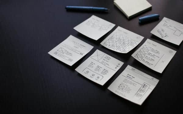
- Build basic ‘lo-fidelity’ prototypes of the products and features you identified and refined in the previous phase. They can be basic, but you do need to build enough that users can get enough of an experience to give useful feedback. This stage is often referred to as wireframing.
- Get these prototypes in front of users. Watch them, listen to them and take as many notes as you can, then iterate, re-prototype and re-test until you have built a winning product.
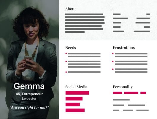
A very key stage of successful UX design is creating personas in the research stage to ensure that everybody, as a collective, is focusing their efforts for the correct audience. Different projects will require more in-depth personas depending on the outcomes that are required.
So, what exactly is a persona? In essence, they are fictitious characters whose goals and characteristics represent the needs of a larger group of users. Usually, a persona is presented with descriptions that include behaviour patterns, goals, skills, attitudes, and background information, as well as the environment in which a persona operates. Designers usually add a few fictional personal details in a description to make the persona a realistic character, as well as context-specific.
Personas are powerful tools. Done properly personas make the design process less complex. They guide the initial ideas processes and help designers to achieve the goal of creating a good UX for the target users. Thanks to personas, designers are able to work in a more mindful way by keeping the real user at the heart of everything they do.
One of, if not the most important stage of successful UX design is wireframing. The process of wireframing refers to the design period in which clients and web experts come together to determine the informational hierarchy of a webpage.
This makes it easier to plan the arrangement of content and the user experience. Wireframes are simple, low fidelity layouts that outline the placement and rough size of specific page elements – from conversion areas to site features. Wireframes ensure that each page has a purpose, achieves the goals set out in the client brief and defines a logical navigation for your website.


Wireframes eliminate any creative choices regarding font, logos or colour because they focus entirely on the core structure of the website. In a way, the wireframe is the skeleton that holds the final design in place. The process happens so that designers and clients can define their final outcome and tweak structural changes to a low fidelity product. This is much faster than making large changes to a fully designed page.
UX design is an ever change world. UX designers are fighting a never-ending battle to stay one step ahead of the game, and keeping on top of the trends is on ongoing process. People’s expectations, standards and needs are always evolving.
UX design is all about the response, emotions and connections that your users make while experiencing your products. It covers a number of areas, but the ultimate aim is always the same: to enhance the user experience.
It is an important part of your business. Positive UX experiences can bring a number of benefits, including an increase in productivity, sales and customer satisfaction.
This blog was written by Andy Lally, Creative Designer at Williams Commerce
If you’re interested in working with our team, get in touch


